
Illustration
Illustration is an eye-catching medium that tells a story in a way that photography, technical diagrams, and icons cannot. Illustrations work well across applications, like presentations, web pages, animations, and motion graphics. We use illustrations to tell conceptual, open stories and describe nuanced ideas in an authentic way.

Open, not closed.
Red Hat® illustrations can convey a topic from a single, simple idea to a conceptual, open story. These stories are not limited or restrained, but extend out to create an imagined world where technology concepts and solutions come to life.
Intentional, not superficial
Our style is refined and thoughtfully designed to complement the complex nature of our products. They’re approachable, but not cartoonish or childlike.
Representative, not stereotypical.
With diverse people and diverse thoughts, the best ideas come from everywhere. We include a broad range of people and environments that go beyond the traditional enterprise technology cliches.
Active, not passive.
Red Hat’s illustration style implies movement and activity. Illustrated people are realistic and dynamic, not oversimplified or static.
Types of illustrations
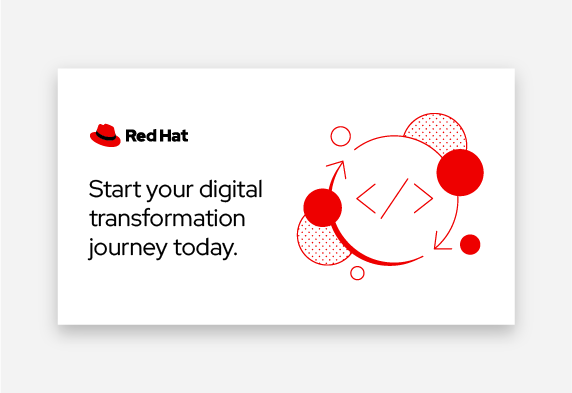
There are 2 styles of illustrations at Red Hat: mini illustrations (minis) and illustrations. Minis convey a single, simple idea and are often based on our icons. Illustrations convey an imagined world where technology concepts and solutions come to life and are driven by a story.
Additionally, illustrations can convey this imagined world with or without incorporating people. While illustrations with and without people do not differ in style, we require additional thought and intention when drawing people.

Mini illustrations (minis)
Minis are used in one color and convey a single, simple idea. They’re often based on our icons but have additional details, which makes them perfect for expressing concepts that are too complex for a small icon, and for use in spaces that are too large for an icon.

Illustrations
Illustrations are driven by a story, and can be used in larger applications compared to minis.
They use elements in a stylized—rather than realistic—color palette to create an imagined world where technology concepts and solutions come to life.

Illustrations with people
Illustrations of people are inspired by photos of real Red Hat associates, customers, and partners.
When including people in an illustration, we give additional time and attention to ensure that the people are realistic and fit in the scene. If we can’t be confident that we are integrating people coherently into an illustration, we don’t include people.
Mini style

Minis are used in one color and convey a single, simple idea. Use solid fills, outlines, and the dot pattern to create detail and shadow.

Center on 1 object
Minis use our icon set as a reference: they center around 1 object, show the object from the front, and use a flattened perspective whenever possible.

Create a 50:50 balance
Minis should be as close to a 50:50 mix between empty and filled space as possible. “Filled space” includes strokes, dots, and filled shapes. This mix helps to balance the entire illustration.

Light source
Minis use a dot pattern to create texture and filled elements to create shadows and dimension. Light should be cast from the top left, so shadows will fall towards the bottom right.
Color in mini illustrations

Core color minis
Minis are created in our core color palette, which are ideal for most brand mini illustrations.

Only one-color
Minis are only used in one color. Always start with Red Hat red, but minis can be used in any color in our color palette as long as it’s legible on the background.
Creating a mini illustration

Template
Designers should create minis using our Illustrator template. Minis are designed on a 1080 x 1080 pixel artboard, and should be either the full height or full width (or both) of the 1000 x 1000 pixel key line.

Consistent visual metaphors
Draw your basic shapes to fit within the template. Base your shapes on Red Hat icons so that our metaphors are consistent across our visuals.

50:50 balance
Use Red Hat red to create shadows or fill some shapes. About 50% of the illustration should be empty space and the other 50% should be red and/or dot pattern.

Dot pattern and light source
Use the dot pattern to create lighter shadows or to imply that something is transparent. The light source should always be in the upper left, casting shadows in the lower right.

Movement and depth
Use strokes to add movement or depth to otherwise plain shapes, like the definition in the upper cloud in this example.

More info
Designers can learn more in our Creating Red Hat illustrations slide deck (Red Hat credentials required).
Example mini illustrations

![]()
This mini successfully combines 2 icons and adds appropriate detail and hierarchy to create a more complex and compelling narrative than icons could alone.

![]()
This mini has a defined light source in the top left, is well balanced with a 50:50 filled-to-empty ratio, and uses the dot pattern thoughtfully as an accent.

![]()
This mini illustration uses our standard icon metaphor for “edge” to create a base for the illustration and adds detail while balancing light, shadow, and the dot pattern for texture.

![]()
This mini does not have a well defined light source or clear hierarchy, and the ratio between dot pattern to red fill and white space is not 50:50.

![]()
This mini uses a lot of filled elements and details making it feel heavier than other minis. Use filled elements thoughtfully to create shadows and depth.

![]()
This mini has good hierarchy and balance, but the small details are off. It’s using 2-3 different line weights and the filled elements have a rounded stroke applied.
Minis in use

Use minis as provided, in one of the colors in our color palette.

Do not distort, combine, add colors to, or modify existing minis.

Be consistent when choosing illustrations for the same asset. Use the same style for all illustrations.

Don’t use a mix of different illustration styles on the same asset.
Use minis at a size where all of the details are legible.

Do not use a mini at a size where the details are illegible, like in a pattern. Use an icon pattern instead.

Use minis independently, without additions or modifications.

Do not combine a mini with another illustration or icon. Use a different illustration instead.
Illustration style

Illustrations help to convey complex ideas or stories at a larger scale than mini illustrations. Rather than using one color and the dot pattern found in minis, our illustrations make use of solid colors and negative space to create texture and depth.

Complex ideas or stories
Illustrations use elements in a stylized—rather than realistic—color palette to create an imagined world where technology concepts and solutions come to life.
There is a clear separation between subjects in the foreground and background. We balance fills of color with monowidth strokes to create a sense of depth and openness.

Defined light source
Like minis, consistent use of light and shadow is important. Our illustrations have a clearly defined light source that casts deep shadows, and help to add depth to the imagined world.
Unlike minis, the light source does not always have to be cast from the top left.

Solid colors
Unlike minis, illustrations do not use any textures. They also never use gradients. Instead, illustrations make use of solid colors from the Red Hat color palette and negative space to create texture and depth.
Color in illustrations

Core color illustrations
Illustrations that are created from our core color palette are ideal for most brand illustrations. We use colors with strong contrast to create depth and dimension.

Extended color illustrations
Illustrations that are created using our secondary color palette are ideal for bold illustrations that draw attention. They always include Red Hat red as an accent, which ensures that they still look like Red Hat.
Creating an illustration

Template
Designers should create illustrations using our Illustrator template. Illustrations are designed on a 1080 x 1080 pixel artboard, and should be either the full height or full width of the 1000 x 1000 pixel key line.

Consistent visual metaphors
Draw the main subject(s) of the illustration using basic shapes that are based on our icons and minis so that our visual metaphors are consistent across our visuals.

Complexity
Draw any other objects or elements that are necessary to convey the story. Consider if these elements should be contained in the organic background shape.
Consider adding additional lines or elements to help create movement or interaction in the illustration.

Color and hierarchy
Use our core color palette, or add up to 2 secondary colors in addition to Red Hat red, to help create clear separation between elements in the foreground and background.

Light source and shadows
Consider your light source and use strokes and color to create highlights and shadows in the illustration.
More info
Designers can learn more in our Creating Red Hat illustrations slide deck (Red Hat credentials required).
Example illustrations

![]()
This illustration creates clear separation between objects in the foreground and background, and uses a single light source that helps to provide depth and create a sense of hierarchy.

![]()
This illustration uses a thoughtful color group, consisting of 2 saturated colors from our secondary color palette (teal and purple) in addition to Red Hat red.

![]()
This illustration successfully uses a stylistic color palette, rather than a realistic one.
Aside from use of the people palette for skin tones, all elements in an illustration should use a color palette in a stylistic way that helps to convey the imagined world.

![]()
This illustration does not have a well defined light source. Ensure that you have a singular light source that impacts everything in the scene.

![]()
This illustration introduces a lot of elements into the composition and lacks a strong sense of hierarchy. Create strong shadows to ensure that there is clear separation between objects in the foreground and background.

![]()
This illustration uses a realistic secondary color palette that detracts from the imagined world.
Illustrations in use

Use illustrations as they are provided—always using Red Hat red and ensuring that these illustrations look like Red Hat.

Do not distort, combine, add colors to, or modify existing illustrations in a way that does not look like Red Hat.

When using more than 1 illustration on an asset, ensure that the color palette is consistent.

Do not use more than 1 illustration on the same asset that uses different color collections.

Use illustrations large enough that the details are legible and they fill the available space appropriately.

Do not use illustrations at a size that’s too small to see the details.

Use illustrations independently without additions or modifications.

Do not combine an illustration with another illustration, mini, or icon. Use a different illustration instead.
Illustrations with people

Our illustrations of people depict a diverse community by reflecting the world as it truly exists. We use photos of real people as a source for our illustrations—not our own ideas of people–to prevent unintentional biases and stereotypes.
Considering diversity, equity, and inclusion is a significant part of our process for creating illustrations. Make sure illustrations are reviewed by others— other designers, your peers, and our Red Hat Diversity, Equity, and Inclusion community members.
When creating illustrations of people, always be intentional and thoughtful. Allow time to research, listen, and adjust.
Skin tones
To create realistic skin tones in our illustrations, we use our people palette. Regardless of the color palette used for the rest of the illustration, always use realistic skin tones for people.
For each person, choose 1 skin tone family. Skin tone families are described differently than traditional colors; cool tones lean towards pinks while warm tones lean towards yellows and browns. Learn more about our color palette.
cool-tone-10
#ffe3dc
cool-tone-20
#f7c8bb
cool-tone-30
#e8a997
cool-tone-40
#ce8873
cool-tone-50
#a66552
cool-tone-60
#724335
cool-tone-70
#40251d
warm-tone-10
#ffe9dc
warm-tone-20
#f9d5c0
warm-tone-30
#edbea1
warm-tone-40
#d8a381
warm-tone-50
#b88564
warm-tone-60
#8e6549
warm-tone-70
#664934
Drawing people
When we’re representing people, there is no room for error. To be intentional and thoughtful, we must allow time to research, listen, and adjust. If we cannot be confident that we are doing our best to represent people thoughtfully and respectfully, we should not use illustrations of people.
Basing our illustrations off of photos ensures that they are representative of a diverse community. Make sure that reference photos are reflective of real people from Red Hat communities.
Anatomy

Anatomy
Our people use natural proportions and anatomy with some very slight stylization. Line work should feel fluid and connect the full form in a way that feels sophisticated.
A.
Slightly enlarged head, but not so enlarged that it is noticeable.
B.
True to reality arm, torso, and lower body form—with slight simplification of lines.
C.
Rely on shadow and strokes for more detail as needed.
D.
Natural foot size—no shrinking or enlarging for stylization purposes.
Facial features

Facial features
Facial features, especially eyes, may be slightly enlarged for stylization. Overall, don’t overwork the face, and focus on staying simple while still maintaining individuality.
A.
Tapered eyebrows
B.
Monowidth stroke for eyelids
C.
One dot per eye, no eye whites
D.
Nose: monowidth stroke, small stroke for nostril, 1 or 2 shades darker than the skin tone
E.
Two toned lips, or fill on top and outline on bottom
Adding light

Adding light
Start by drawing the silhouette with the person’s main skin tone, then step back one tone and add a highlight where light hits the face.
This creates contrast for all skin tones which allows the facial features to be visible and provides more definition to the profile of faces.
How to incorporate people into illustrations

Illustrated people are lifelike and dynamic, not oversimplified or static. Illustrated people should always be interacting with their imagined world in a way that feels realistic.

Locate and use a single light source that impacts all subjects and elements in the scene. Use strokes and solid colors to create highlights and shadows thoughtfully.

Illustrate people with enough detail that represents them thoughtfully and creates individuality. If we incorporate people into an illustration, the people should be integral to the illustration and not a background element.

Do not place illustrated people arbitrarily on an existing illustration. If we cannot be confident that we are integrating people realistically within an illustration, we should not use illustrations of people.

Do not arbitrarily shade subjects and elements in the scene in a way that implies multiple light sources.

Do not illustrate people with little to no facial features, or in a way that erases their individuality.